

Expander
An outlined frame with a header (a bold title and a chevron) that takes the press. While it is open, a rule and a body follow the header, and you build the content into the body. An accordion is several expanders, with the caller keeping track of which one is open.

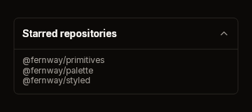
Fixtures: expander-closed and expander-open.
Build
public static ExpanderWidget Expander(
    this BibuiRuntime runtime,
    string id,
    ReadOnlySpan<char> title,
    bool open)

public readonly record struct ExpanderWidget(Box Node, Box? Body, Interaction Interaction)
{
    public bool Toggled { get; }   // the header was clicked
}

public const float HeaderHeight = 44f;| Parameter | Meaning |
|---|---|
id | The header's retained box. |
title | The header's bold title. |
open | Whether to show the body. |
The frame is as wide as its parent. While open, Body is a padded column as wide as the frame and as tall as what you build into it. While closed, Body is null.
Claims and reports
- The header claims
InteractionKinds.LeftPress. - It returns an
ExpanderWidget.Toggledmeans the header was clicked this frame.Interactionhas the rest.
State the caller owns
Whether it is open.
Theme tokens
- Frame and rule:
Border,runtime.Theme.Borders.Widthwide. - Title:
TextColor.Primary, bold. Chevron:TextSecondary. - Header height: 44 px, scaled by
runtime.Theme.Density.
Example
using Bibui.Core;
using Bibui.Core.Runtime;

sealed class StarredRepositories
{
    const string Title = "Starred repositories";
    static readonly string[] Lines = ["@fernway/primitives", "@fernway/palette"];

    bool _open;   // the caller's state

    public UiNode Build(BibuiRuntime runtime)
    {
        var column = runtime.BeginParent(runtime.Column().Sized(Size.Px(320f)));
        var section = runtime.Expander("starred", Title, _open);
        if (section.Toggled) _open = !_open;
        if (section.Body is { } body)
        {
            runtime.BeginParent(body);
            foreach (var line in Lines)
                runtime.Text(line, ComponentSize.Sm, TextColor.Secondary);
            runtime.EndParent(body);
        }
        runtime.EndParent(column);
        return column;
    }
}