Progress
A progress bar: a pill-shaped track holding a filled pill as long as the share done, with an optional label above. It takes nothing.
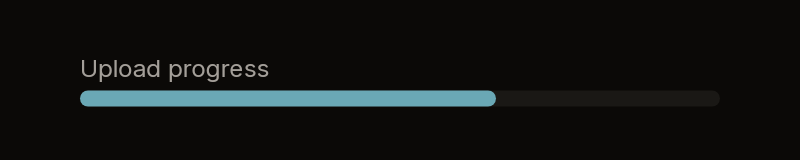


Fixtures: progress-labelled, progress-empty and progress-full.
Build
public static Box Build(
    BibuiRuntime runtime,
    float value,
    float max = 100f,
    ReadOnlySpan<char> label = default,
    float thickness = DefaultThickness,
    UiColor? fill = null,
    UiColor? track = null)

public const float DefaultThickness = 8f;| Parameter | Meaning |
|---|---|
value, max | The share done is value / max, clamped to 0..1. |
label | A small secondary caption above the track. |
thickness | The track's height in pixels. |
fill, track | The filled part's and the track's colours, if not the defaults. |
It is as wide as its parent unless you size the node it returns: the column with the label, or the track alone.
Claims and reports
None. It returns a keyless Box.
State the caller owns
The value.
Theme tokens
- Track:
track, orSurfaceRaised. Fill:fill, orAccent. - Label:
TextColor.Secondary, at the small size.
Example
using Bibui.Core;
using Bibui.Core.Runtime;

sealed class UploadProgress
{
    const string Label = "Upload progress";

    public long Sent { get; set; }          // the caller's state, shown
    public long Total { get; set; } = 1;

    public UiNode Build(BibuiRuntime runtime)
    {
        Box bar = Progress.Build(runtime, Sent, Total, Label);
        bar.SizeX = SemanticSize.Pixels(320f);
        return bar;
    }
}