RadioGroup
A column of options, each a 16 px ring and a label. The chosen option has a dot in its ring. Each row takes its own press, so the label is as much a target as the ring.
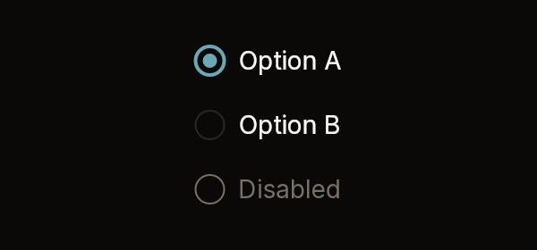
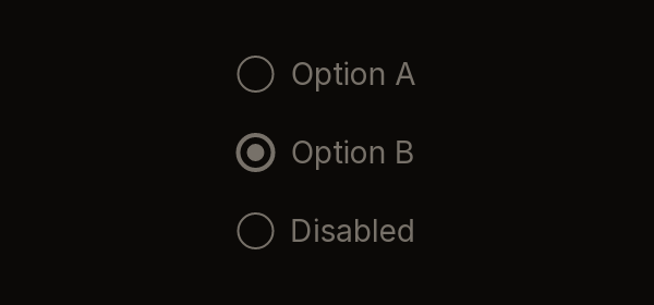
Fixtures: radio-group-default and radio-group-disabled.
Build
public static RadioGroupWidget RadioGroup(
    this BibuiRuntime runtime,
    string id,
    IReadOnlyList<RadioOption> items,
    string? value,
    bool disabled = false)

public readonly record struct RadioOption(string Label, string Value, bool Disabled = false);
public readonly record struct RadioGroupWidget(Box Node, string? Picked);| Parameter | Meaning |
|---|---|
id | Names the rows: {id}-{value}. |
items | The options in order. An option with Disabled swallows its press. |
value | The chosen option's value, or null for none. |
disabled | Disables every option. |
Claims and reports
- Each row claims
InteractionKinds.LeftPress, orDisabledwhen that option or the whole group is disabled. - It returns a
RadioGroupWidget.Pickedis the value of the option clicked this frame, or null. Clicking the option that is already chosen reports nothing.
State the caller owns
The chosen value.
Theme tokens
- Ring edge:
Accentwhen chosen, otherwiseBorder, andTextDisabledwhen disabled. It isruntime.Theme.Borders.Strongwide when chosen, otherwiseBorders.Width. - Dot:
Accent, orTextDisabled. - Label:
TextColor.Primary, orTextColor.Disabled. - Row height: 32 px, scaled by
runtime.Theme.Density.
Example
using Bibui.Core;
using Bibui.Core.Runtime;

sealed class ShippingChoice
{
    static readonly RadioOption[] Options =
    [
        new("Standard", "standard"),
        new("Express", "express"),
        new("Same day (sold out)", "same-day", Disabled: true),
    ];

    string _shipping = "standard";   // the caller's state

    public UiNode Build(BibuiRuntime runtime)
    {
        var group = runtime.RadioGroup("shipping", Options, _shipping);
        if (group.Picked is { } picked) _shipping = picked;
        return group.Node;
    }
}